- E-commerce
- Conversion design
- In implementation
Vacier: redesigning a jewelry store for conversion
A full, mobile-first redesign of Vacier's online store. The goal was simple: more of the people who already love the product should finish the purchase.
- screens designed
- 50+
- flows: product, cart, checkout, post-purchase
- 4
- average rating the store had to live up to
- 4.96
At a glance
The challenge
A loved product with a 4.96 rating, and a store that had to be redesigned around one number: conversion rate.
What I did
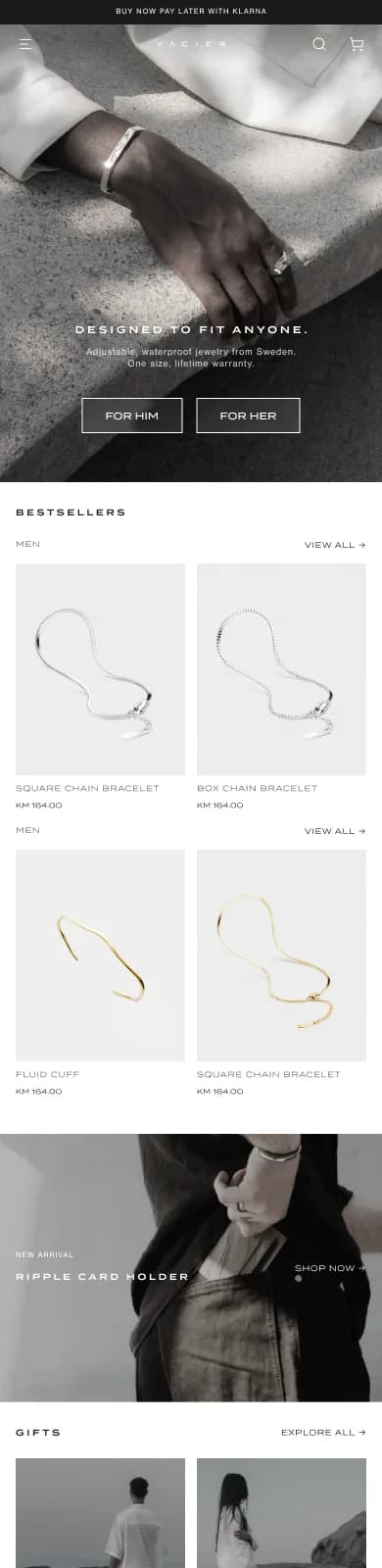
Audited the live store, then redesigned it mobile-first: category-aware product pages, cart drawer, single-page checkout, search and navigation.
Outcome
Design complete and handed off; Vacier’s team is implementing it now. It will be judged on conversion, order value and checkout completion.
01 · The brief
A loved product, a store that loses people
Vacier sells minimalist jewelry and leather accessories, with a 4.96 rating across thousands of reviews. The product was not the problem. The job was to redesign the whole store around conversion rate, from the first product page to the thank-you screen, with mobile first.
Before designing anything I audited the live store: navigation, every product category, the cart, checkout and the real shipping and returns policies. Every price, size and policy in the design matches what Vacier actually sells, so the developers can build straight from it.
02 · Product pages
One template didn't fit four products
The audit showed that product pages can't share one template. Bracelets come in three sizes with an extension chain. Rings are one size but adjustable. Earrings and necklaces have no size at all, and a premium 925 silver range sits beside the steel one at a very different price. A single template either hides the sizing information people need or shows irrelevant controls.
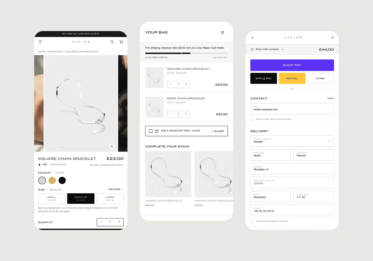
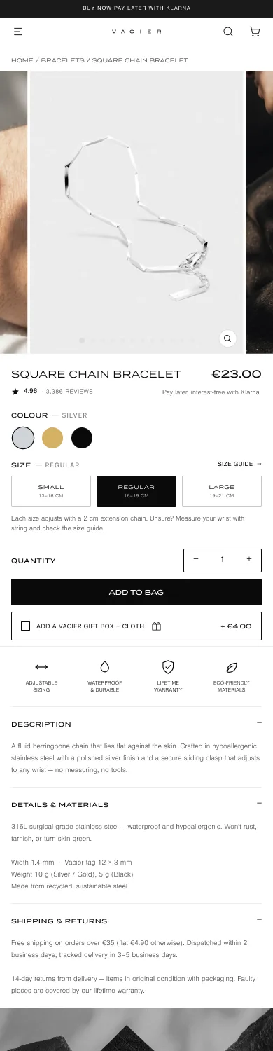
So the product page became category-aware. The size selector, the "adjustable" badge, the benefits and the spec fields change by product type. For bracelets, the size selector links to a new size guide with real wrist measurements.
Other decisions on the page:
- Klarna is mentioned next to the price, with a gift-box add-on right under "Add to bag"
- Four benefit icons: adjustable, waterproof, lifetime warranty, eco-friendly
- The rating sits next to the title, and a sticky "Add to bag" bar stays in reach while scrolling
03 · Cart
A cart drawer that sells, without getting in the way
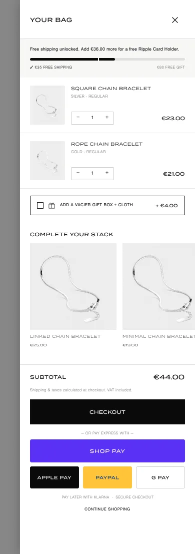
Vacier's cart is a slide-out drawer, so I kept that pattern and optimized it:
- Free-shipping progress bar with two tiers (free shipping at €35, a free card holder at €80), so a small top-up has a visible reward
- "Complete your stack" suggestions and a one-tap gift-box add-on
- Express checkout (Shop Pay, Apple Pay, PayPal, Google Pay) directly in the cart, for people who have already decided
- Bigger tap targets; at quantity one, the minus button turns into a trash icon, so it's clear what it will do
04 · Checkout
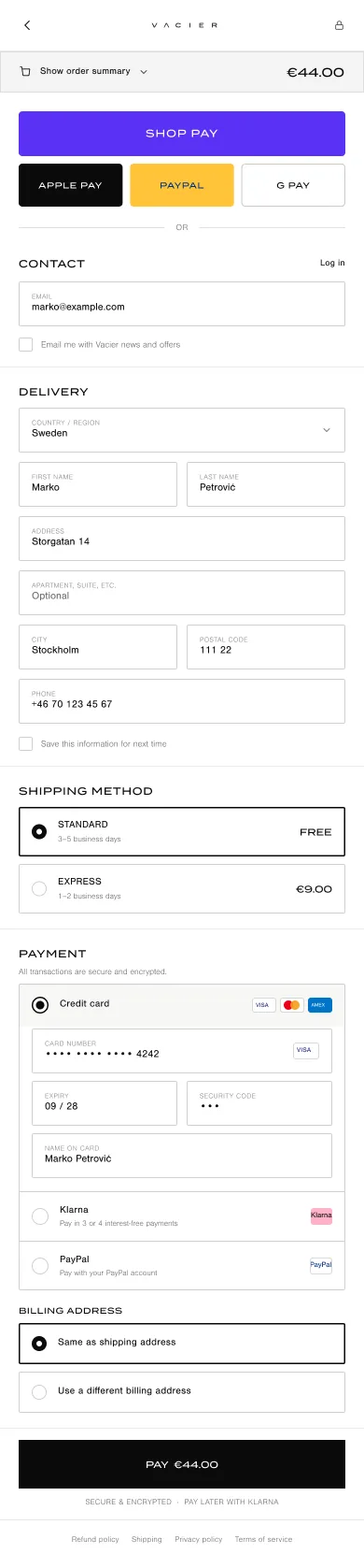
Nothing between the customer and "Pay"
Checkout became a single page in the Shopify pattern. It has express payment at the top and floating-label fields. The order summary is collapsed by default on mobile, so the form starts higher on the screen. A payment method selector covers card, Klarna and PayPal.
A deliberate "no": I left order bumps out of checkout. Upsells live in the cart, where people are still browsing, and after purchase, where they cost nothing. Checkout does one job.
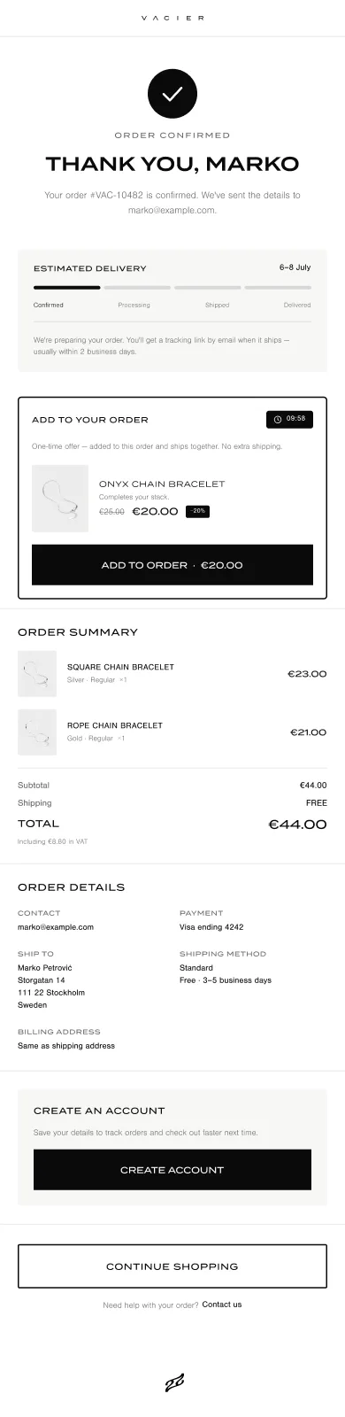
The order confirmation page does real work too. It shows an estimated delivery tracker, says when to expect the tracking email, prompts people to create an account, and offers a post-purchase add-on with a countdown that can be added to the order already placed.
05 · Around the funnel
The rest of the store
Conversion also depends on the rest of the store: finding the product, trusting the brand and getting help. The redesign also covers:
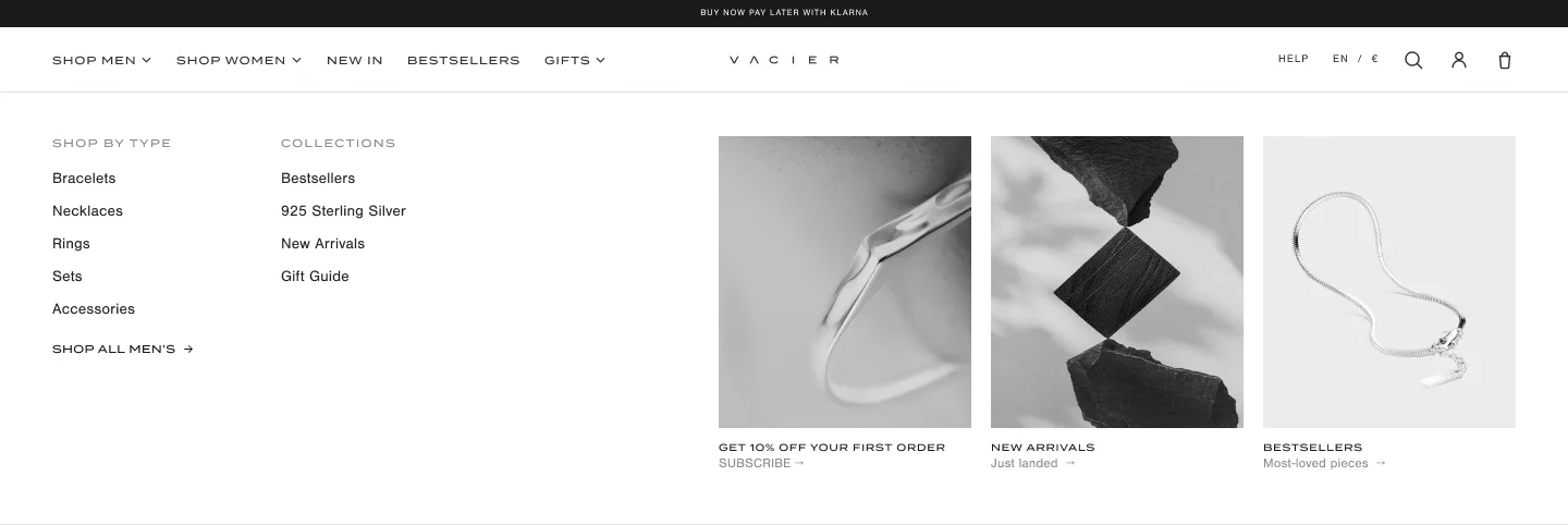
- Navigation: a drill-down mobile menu and a desktop mega-menu, split by men and women the way Vacier's collections actually are
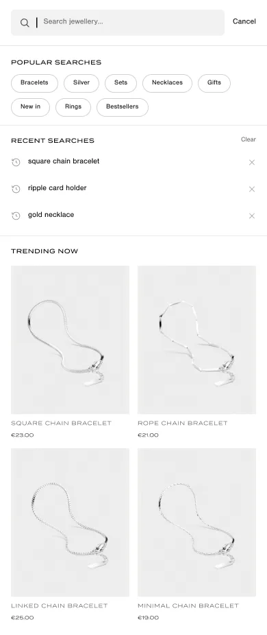
- Search: popular searches and trending products before typing, and a results page that reuses the listing filters
- Filter and sort as bottom sheets, account pages (orders, wishlist, addresses) and every empty and error state
- Content: 11 help and legal pages consolidated into 7, with an FAQ accordion and a single Shipping & Returns page
06 · Outcome
Designed, handed off, being built
The design is complete and Vacier's team is implementing it now. The redesign will be judged on conversion rate, average order value and checkout completion once it's live.
More work
All work →

Want to work together?
Whether it’s a product role, a bold project, sharing a beer or exploring a new corner of the world, I’m ready. I usually reply within a day.