- Product design
- Co-founder
- Live product
Kojeza: an adventure booking platform, from zero
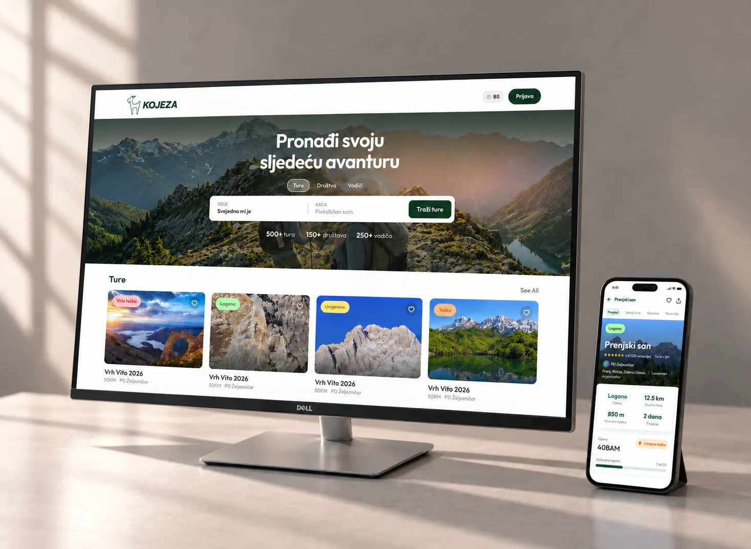
I co-founded Kojeza and designed the whole product: brand, discovery, tour pages, onboarding and booking. Guided tours in Bosnia and Herzegovina can now be found and booked in one place.
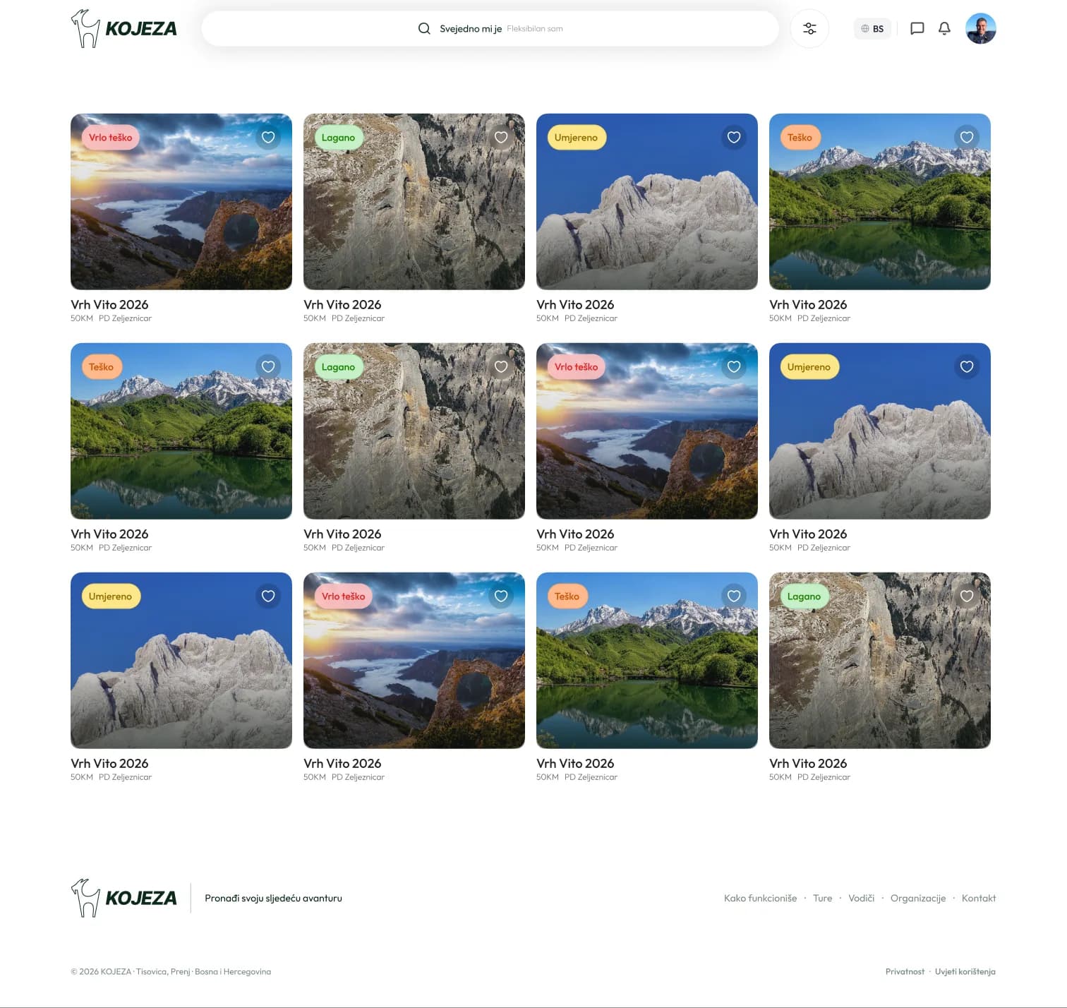
- tours on the platform
- 500+
- mountaineering societies and organizations
- 150+
- guides
- 250+
At a glance
The challenge
Tours, the societies that run them and their guides had no shared place online where hikers could find and book them.
What I did
Brand and goat mascot, the full UX/UI of the web app, onboarding and booking flows, mobile adaptation, QA and sales decks.
Outcome
Live at kojeza.com with 500+ tours, 150+ organizations and 250+ guides. Mandatory onboarding cut from 6 steps to 2.
01 · Overview
One place for tours, societies and guides
Kojeza brings three things together: tours, the societies that organise them and the guides who lead them. A hiker picks a tour by date and difficulty, checks who runs it, and books it. The organiser gets a profile, reviews and bookings without building their own site.
As co-founder I owned everything a user sees. That covered the logo, visual identity and the goat mascot, the full UX and UI of the web app, and QA before every release. I also made the presentations and sat in the sales conversations with the organisations we brought onto the platform.
02 · Brand
A goat, a mountain and a friendly guide
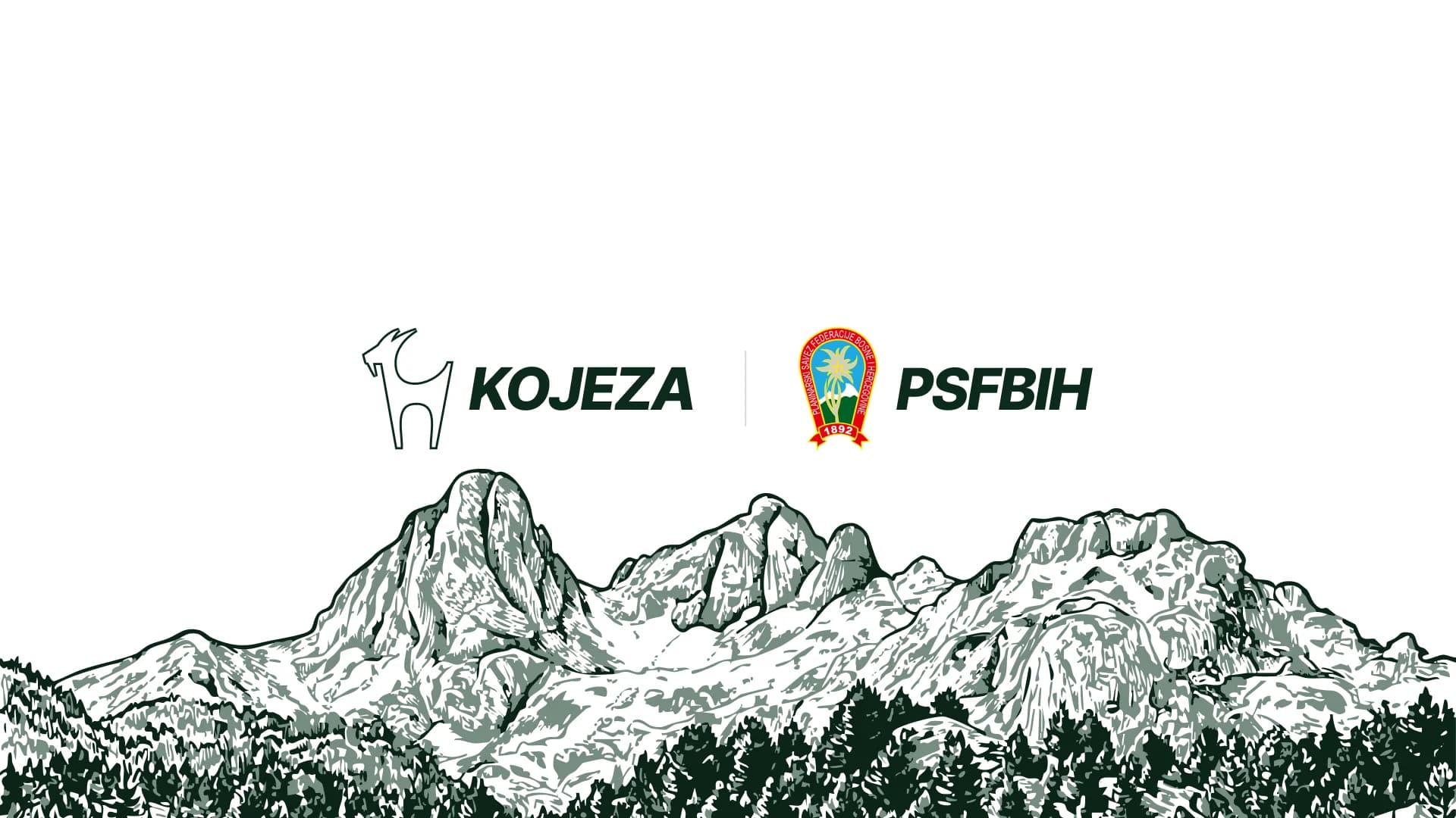
The name reads as "Ko je za?", Bosnian for "Who's in?", the question behind every group hike. The logo is a single-line goat, the animal that owns these mountains, set next to a heavy italic wordmark that leans forward like someone already on the trail.
I designed the logo and the whole visual identity: a deep forest green with softer greens and a warm off-white ground, one typeface (Outfit) across the product, and no shadows anywhere.
- Forest#0C2A1B
- Pine#4F8A6F
- Moss#86B19E
- Mist#D9E6E0
- Ground#FBF8F6
The Tisovica valley, drawn by hand
The hero illustration is an engraved outline of the Tisovica valley on Prenj. It's a real place hikers recognise, drawn in the brand greens. It works as a full-width header on the site and as the backdrop of our presentation to the Mountaineering Association of the Federation of BiH.
A mascot, the Duolingo way
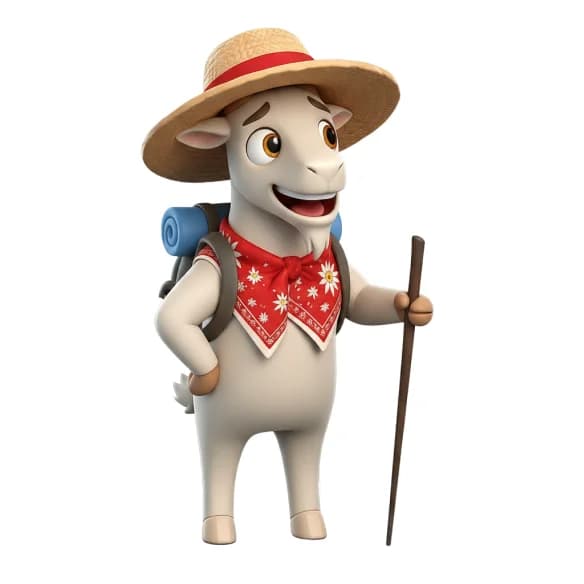
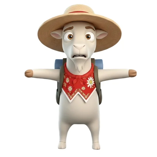
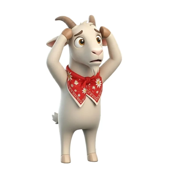
Duolingo's owl proves that a character can carry a product's personality better than any copy. So Kojeza got a goat. I art-directed a set of 3D goat mascots, generated with Gemini and ChatGPT and then curated for one consistent look: a hiker with a straw hat and walking stick, and the same goat with its arms spread wide or scratching its head. Each one wears a red bandana with edelweiss, the flower on the Mountaineering Association's own emblem.
Like Duolingo’s bird, the goat appears throughout the app wherever it makes sense, above all at the moments where a user needs a nudge: finishing their profile, taking the next step toward a booking, or celebrating when something is done.
03 · Discovery
Search that starts from "I just want to go somewhere"
Search defaults to "Anywhere" and "I'm flexible", so someone who only has a free weekend still gets results. Every tour card carries a colour-coded difficulty tag (easy → very hard), so fitness level can be judged at a glance before opening a tour.
04 · Tour page
Everything needed to say yes
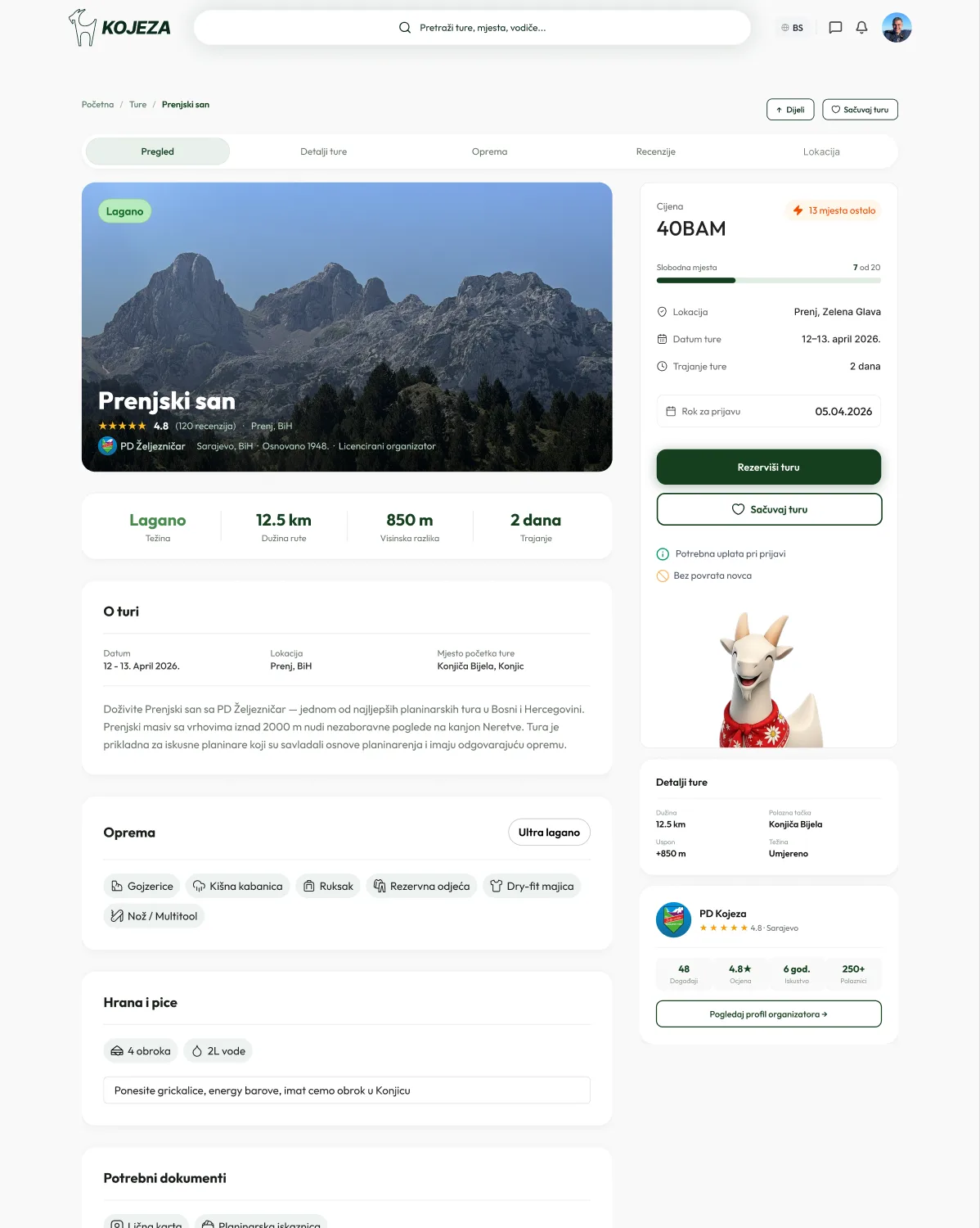
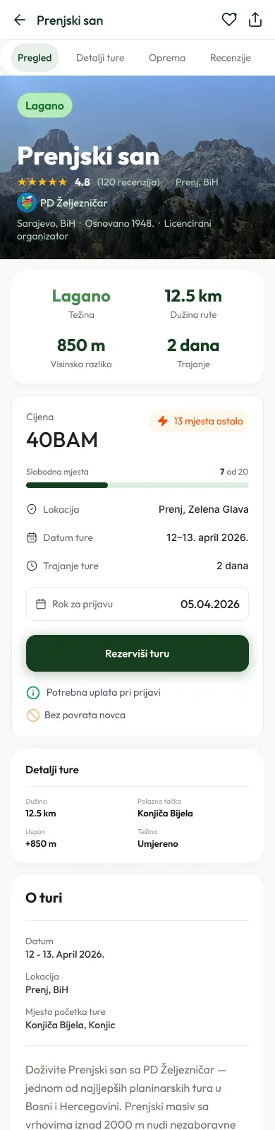
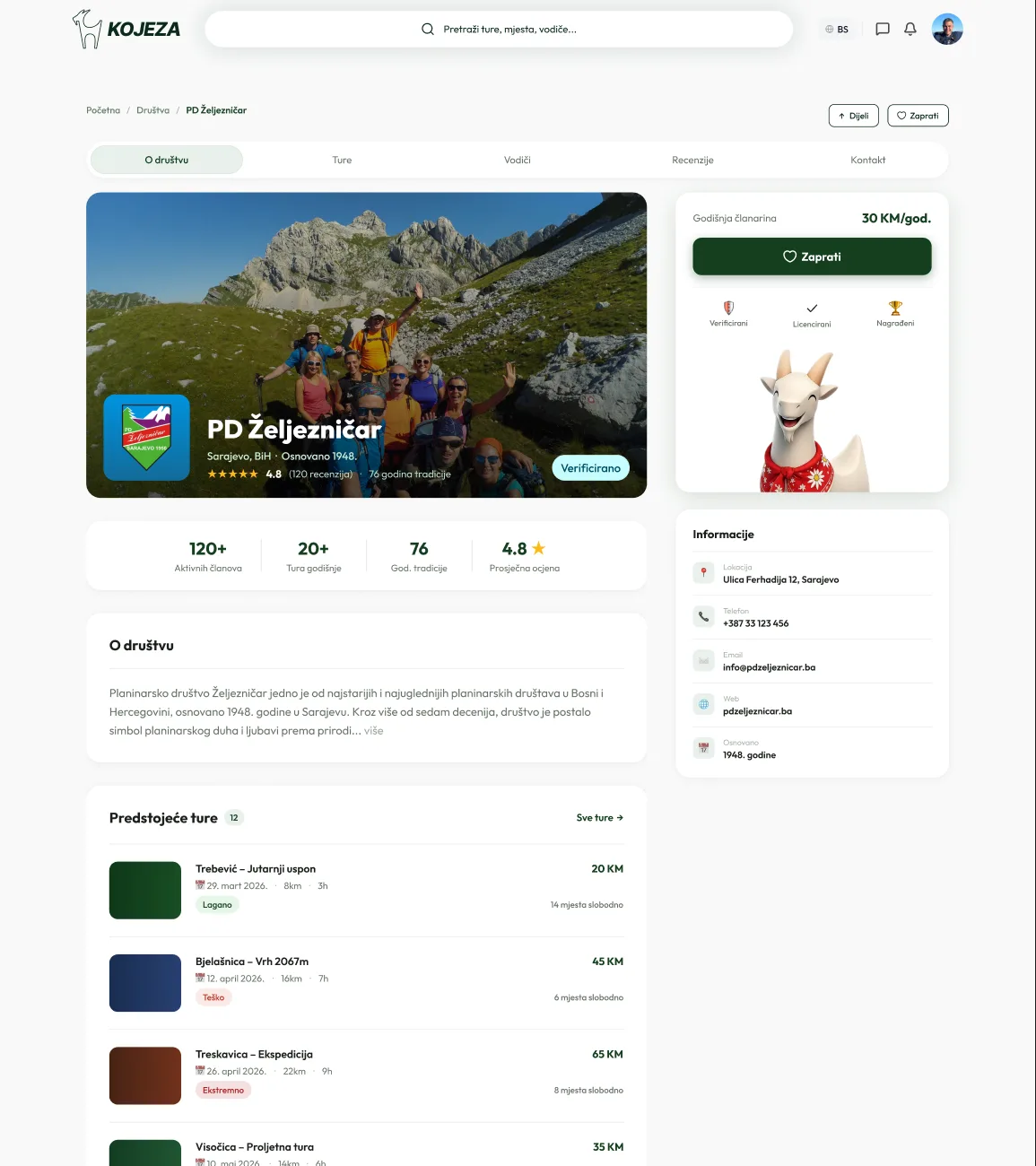
The tour page answers the questions in the order people ask them: what it looks like, how hard it is, when it is, what it costs, and who runs it. The booking card stays visible the whole time. Society and guide profiles link back to their tours and reviews, so trust builds across the platform, not just on one page.
05 · Onboarding
Finding the gap between design and the live app
After launch I tested both sign-up paths on the live app, step by step. Google sign-up worked as designed: welcome screen, then a guided profile setup. Email sign-up did not. After confirming their email, people landed on the homepage with no welcome and no prompt to complete their profile. The two paths into the product had quietly split.
The audit also found states the design never covered: no confirm-password field, no validation or error states, no password rules and no "email confirmed" screen. I designed all of them.
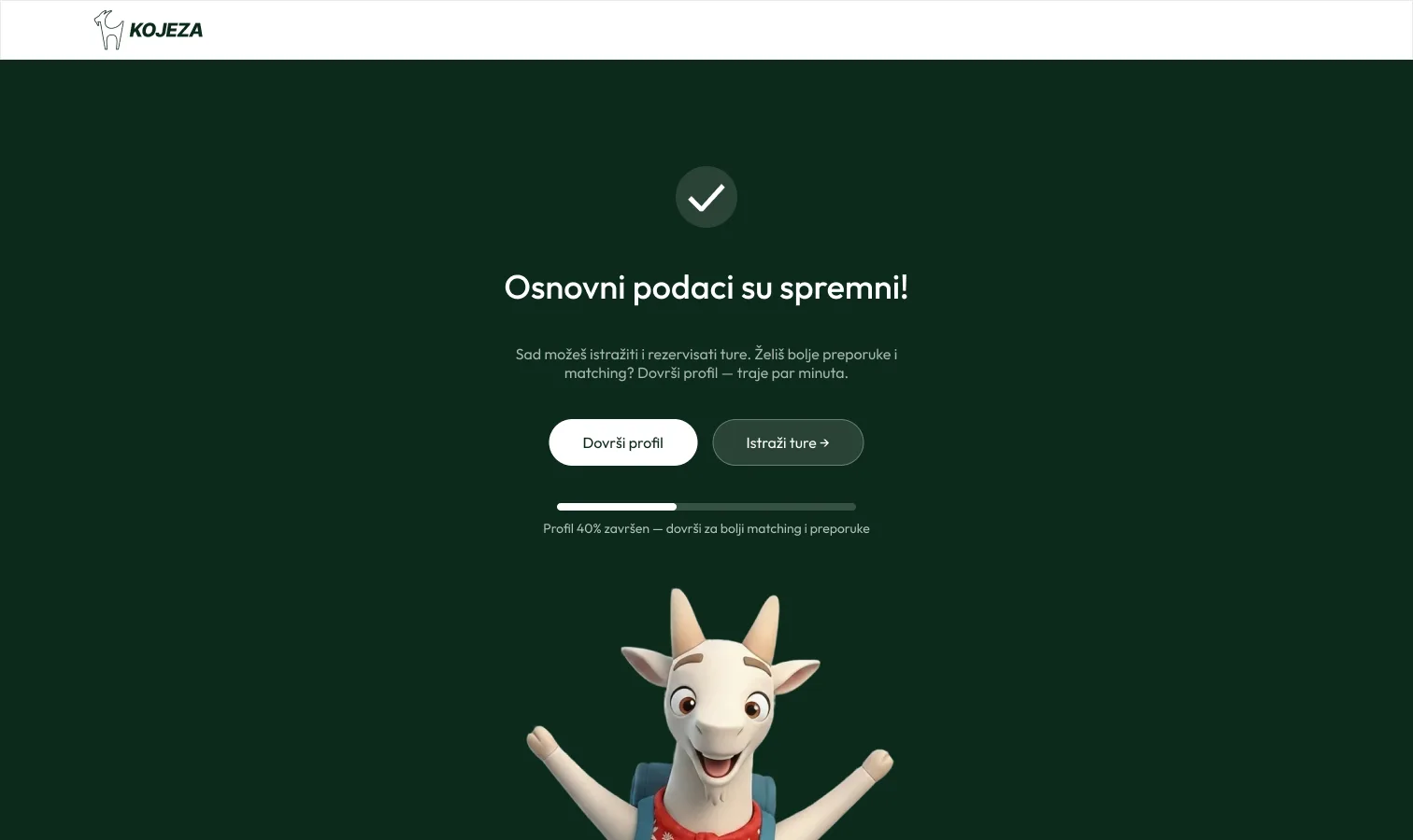
The bigger decision was how much to ask for. The original onboarding was a 6-step profile covering identity, contact, hiking experience, health and gear. Asking for all of it before someone has seen a tour costs sign-ups. I cut the mandatory part to two steps, identity and contact. The rest became optional and is nudged later.
Everything else became optional and is nudged later from a hub screen with a progress bar.
The emergency contact is important for mountain safety, but it is not needed to browse. It moved to the moment it matters: it is asked just in time during booking, with a clear note on why and how it's used, and it can be skipped. After the two basic steps, a hub screen lets people choose between exploring tours and finishing their profile, with a progress bar showing what's left.
06 · Booking
Mapping the flow before drawing screens
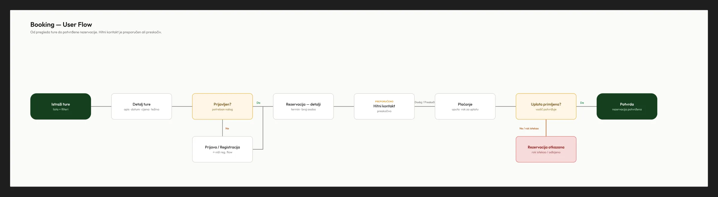
Booking has more branches than a normal checkout: the guide confirms the payment, and a booking can expire. I mapped the whole flow first, including login, the optional emergency contact, payment confirmation and cancellation. Then I designed the three-step stepper (Reservation → Payment → Confirmation) against it.
07 · Mobile
Adapting a desktop-first product to 390px
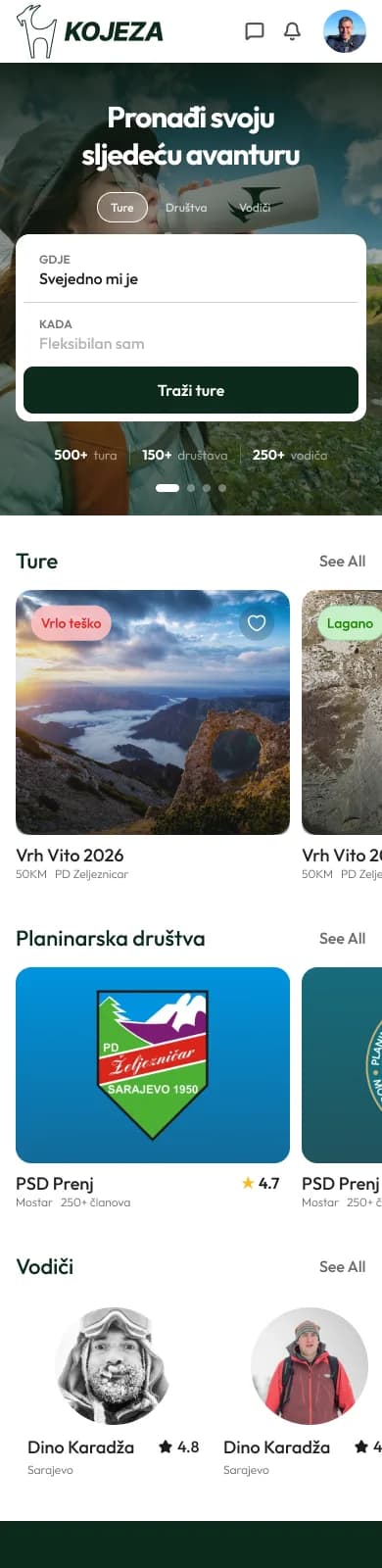
The product was designed desktop-first, so I adapted the key screens to mobile. Sidebar cards move inline, the tab strips scroll horizontally, and a sticky bottom bar keeps the price and the "book" button in reach. Similar tours become a swipeable carousel.
08 · Outcome
Live, and bringing people in
Kojeza is live at kojeza.com with 500+ tours, 150+ organizations and 250+ guides. We are now focused on bringing hikers in.
What I took from it
- 01Test the live product, not the Figma file.
The onboarding gap only showed up when I went through the real sign-up flows myself.
- 02Ask for data when it's needed.
Moving the emergency contact to booking kept onboarding short without losing a field that matters for safety.
- 03Being a co-founder changes design decisions.
I heard what organisations needed directly in sales conversations, so I didn't have to wait for a brief.
More work
All work →
Want to work together?
Whether it’s a product role, a bold project, sharing a beer or exploring a new corner of the world, I’m ready. I usually reply within a day.